Makeover Monday: Percentage of Patients Spending 4 Hours of Less in A&E by Provider

A little late in posting this, and I was pretty prompt in making it too. Makeover Monday on 3rd July concerned the above graphic, in turn based on statistics relating to accident and emergency visits at NHS Trusts across the UK.
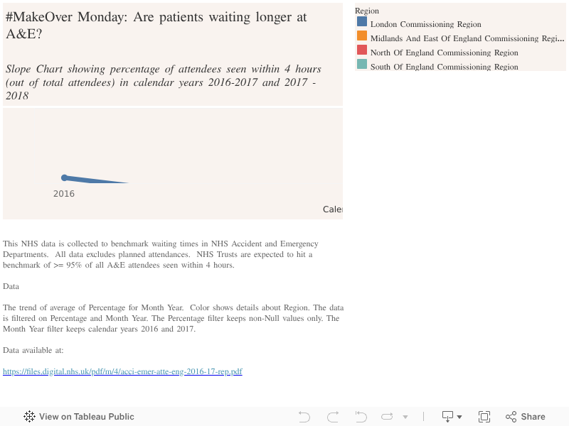
This NHS data is collected to benchmark waiting times in NHS Accident and Emergency Departments. All data excludes planned attendances. NHS Trusts are expected to hit a benchmark of >= 95% of all A&E attendees seen within 4 hours.
Data
The trend of average of Percentage for Month Year. Color shows details about Region. The data is filtered on Percentage and Month Year. The Percentage filter keeps non-Null values only. The Month Year filter keeps calendar years 2016 and 2017.
The original data is available at: https://files.digital.nhs.uk/pdf/m/4/acci-emer-atte-eng-2016-17-rep.pdf
I like a symbol map, but in this case, the drawing skeuomorphic push pins make it difficult to read the data. Further, the colour palette could be varied to make the map easier to read.
For this project, rather than build a dashboard that explored various aspects of the data, I sought to complete under time restrictions again (1 hour). I thought about what headline statistic we might want to use to ask whether patients were waiting at A&E for longer or shorter. My conclusions were:
- There was sufficient variance in the wait times on a geographic basis to warrant showing this in the visualisation
- It would be more transparent to show variance in the performance of geographies over time
- It would be possible to aggregate up to commissioning level in order to give an impression of geographic performance over time
My conclusion was that a slope graph would help to convey the data in this case, not least because the KPIs and performance were such that in aggregating performance to commissioning region level, each hovered over time around the 90th to the 95th percentile.
The layout remains not quite as I would wish as I am still getting to grips with tableau, but the results are I think fairly clear.
It would be nice to dive deeper into performance across types of patient complaint on admittance and to perhaps perform a heatmap of days of the week and months of admittance if descending the lower levels of detail.